
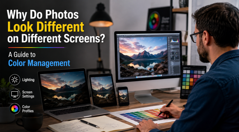
Why Do Photos Look Different on Different Screens? A Guide to Color Management
Have you ever edited a photograph on your computer and then opened the same image on your phone, only to notice that the colors look different?
The image may appear brighter on one screen, darker on another, warmer on a mobile device, or more saturated on a high-quality monitor. This is a common issue in digital photography and image editing.
In many cases, the photo itself has not changed. Instead, the difference comes from how individual devices display color.
Every screen has its own brightness settings, color capabilities, display technology, and calibration. Because of these differences, the same image file can appear slightly different depending on where it is viewed.
For photographers, eCommerce businesses, designers, marketers, and professional photo editors, understanding color management is important. Proper color management helps create images that look more consistent across websites, mobile devices, monitors, and other digital platforms.
This guide explains why photos look different on different screens and how color spaces, color profiles, monitor calibration, and professional editing workflows help improve color consistency.
Why Does the Same Photo Look Different on Different Screens?
A digital image contains color information, but the device displaying that information determines how the final image appears.
For example, the same photograph may be viewed on:
- A desktop monitor
- A laptop
- A smartphone
- A tablet
- A smart television
The image file remains exactly the same, but the appearance may change.
Several factors cause these differences.
Display Brightness
One of the most common reasons is screen brightness.
A monitor with high brightness can make a photograph appear lighter and more vibrant. The same image viewed on a darker screen may appear less detailed in shadow areas.
Brightness affects how viewers perceive:
- Exposure
- Shadow details
- Highlights
- Product colors
- Skin tones
- Overall contrast
This is why an image edited on an extremely bright monitor may look too dark when viewed on another device.
Different Color Capabilities
Not every display can reproduce the same range of colors.
Some professional monitors are designed to display a wider range of colors. Older monitors and lower-quality displays may show fewer colors.
As a result, bright and highly saturated colors may appear vivid on one screen and dull on another.
User Settings
Users can also change their device settings.
They may adjust:
- Brightness
- Contrast
- Color temperature
- Saturation
Many modern devices also include automatic features that change screen appearance depending on the environment.
Night mode and blue-light filters can make an image appear warmer or more yellow. Automatic brightness settings can also change the appearance of photographs.
Understanding Digital Color
Most digital images use the RGB color model.
RGB stands for:
- Red
- Green
- Blue
Screens create colors by combining different amounts of red, green, and blue light.
Digital images store color information as numerical values.
However, RGB values alone do not guarantee that a color will look identical on every screen.
The same color values can appear differently depending on how the display interprets them.
This is where color spaces become important.
What Is a Color Space?
A color space defines a range of colors that can be represented by an image.
Think of a color space as a map that defines which colors are available and how those colors should be interpreted.
Different color spaces contain different ranges of colors.
The most commonly used color spaces in photography include:
- sRGB
- Adobe RGB
- ProPhoto RGB
Each one is used for different purposes.
What Is sRGB?
sRGB is one of the most widely used color spaces for digital images.
It is commonly used for:
- Websites
- Online stores
- Social media
- Mobile devices
- Web browsers
- Standard computer displays
Because sRGB is widely supported, it is generally the safest choice for images intended for online viewing.
For example, an eCommerce business may upload hundreds of product images to its website. Using a consistent web-friendly color space helps create more predictable results across different browsers and devices.
This does not mean every device will display the image exactly the same way, but it reduces potential compatibility issues.
For most websites and digital marketing campaigns, sRGB is commonly used as a standard color space.
What Is Adobe RGB?
Adobe RGB is a wider color space than sRGB.
It can represent a larger range of certain colors and is commonly used in professional photography and commercial image production.
Adobe RGB can be useful when working with high-quality photographs and advanced editing workflows.
However, using a wider color space does not automatically mean the image will look better everywhere.
If an image is displayed by software or a device that does not correctly interpret its color profile, the colors may appear inaccurate.
The best color space depends on the final use of the image.
What Is ProPhoto RGB?
ProPhoto RGB is an extremely wide color space used in advanced photography workflows.
Professional photographers may use it while processing high-quality RAW files because it provides a large working range for color adjustments.
However, it is generally not the preferred choice for standard web images.
Images are often converted into a more suitable color space depending on where they will eventually be displayed.
What Is an ICC Color Profile?
An ICC color profile helps devices and software interpret color information more consistently.
The profile provides instructions about how color values should be displayed.
For example, an image may contain specific RGB values, but software needs additional information to understand how those values should appear.
Color profiles are used in:
- Cameras
- Monitors
- Printers
- Scanners
- Editing software
- Digital image files
Without proper color profiles, the same image may appear differently when opened in different applications or devices.
Why Monitor Calibration Matters
A monitor may not display colors accurately.
Over time, screens can change. Brightness levels, color balance, and display performance can gradually shift.
This creates problems for photographers and editors.
Imagine an editor working on a monitor with a strong blue tint.
The editor may add warm yellow tones to correct what they see on the screen. The image may look correct on that monitor.
However, when viewed on a properly calibrated display, the final image may appear too yellow.
This is why professional photo editing workflows often use calibrated monitors.
What Is Monitor Calibration?
Monitor calibration is the process of adjusting a display to reproduce colors more accurately.
Professional calibration tools can measure:
- Brightness
- White point
- Gamma
- Color accuracy
The calibration process creates a display profile that helps color-managed software show images more consistently.
Professional photographers and image editors may calibrate their monitors regularly to maintain accuracy.
Why Screen Brightness Can Affect Photo Editing
Many people edit photographs on screens that are too bright.
Modern laptops and monitors can produce extremely high brightness levels.
If an editor works on a very bright screen, a photograph may appear correctly exposed.
However, when the same image is viewed on a normally adjusted display, it may appear too dark.
This is especially important for:
- Product photography
- Real estate photography
- Portraits
- Fashion photography
- Interior photography
Maintaining reasonable and consistent monitor brightness helps editors make more accurate decisions.
Why Photos Look Different on Smartphones
Smartphones often use advanced display technology.
Many mobile devices automatically adjust:
- Brightness
- Color temperature
- Contrast
- Saturation
These adjustments can depend on the surrounding lighting conditions and device settings.
For example, a smartphone may make the display warmer at night to reduce blue light.
A neutral white background may then appear slightly yellow.
This does not necessarily mean the photograph was edited incorrectly. The device itself may be changing the display appearance.
For online images, using a widely supported color space helps improve consistency across different devices.
Why Product Colors Require Careful Color Management
Color accuracy is particularly important for eCommerce businesses.
Customers often make purchasing decisions based on product images.
If product colors are inaccurate, customers may receive something that looks different from what they expected.
This is especially important for:
- Clothing
- Furniture
- Cosmetics
- Jewelry
- Home décor
- Electronics
For example, a blue shirt photographed under different lighting conditions may appear lighter, darker, warmer, or cooler.
Professional product photography workflows often use consistent lighting and reference standards to improve color accuracy.
How Professional Editors Maintain Color Consistency
Professional photo editing involves more than adjusting brightness and saturation.
A structured workflow helps maintain consistency across large groups of images.
Common quality-control steps include:
Consistent Editing Environment
Professional editors work with controlled monitor settings and consistent editing environments.
Reference Images
Approved images can be used as references.
This helps maintain consistency when editing large image collections.
Color References
Businesses may provide specific color information, including:
- RGB values
- HEX codes
- Brand guidelines
- Physical product samples
Quality Control
Final images may be reviewed for:
- Color consistency
- Exposure
- Background appearance
- Skin tones
- Product accuracy
- Overall visual quality
This is especially important when editing hundreds or thousands of images.
Why Images Can Change After Uploading to a Website
Many people notice that a photograph looks different after uploading it online.
Several factors can cause this.
Image Compression
Some websites automatically compress uploaded images to reduce file size.
Image Resizing
Content management systems may create different image sizes for mobile devices, thumbnails, and website layouts.
Format Conversion
Some websites automatically convert images into different formats to improve loading speed.
Browser and Device Differences
The same image may still appear slightly different depending on the browser and display being used.
Testing important images across multiple devices can help identify major issues before publishing.
RGB vs CMYK
Digital screens use RGB, while professional printing often uses CMYK.
CMYK stands for:
- Cyan
- Magenta
- Yellow
- Black
These systems reproduce colors differently.
Screens create colors using light, while printed materials reproduce color using ink.
Because of this difference, a bright color displayed on a monitor may not look exactly the same when printed.
Businesses preparing images for:
- Brochures
- Catalogs
- Packaging
- Magazines
- Printed advertisements
should consider print-specific color requirements before finalizing files.
Color Correction vs Color Grading
Color correction and color grading are often confused, but they have different purposes.
Color Correction
Color correction focuses on making an image appear balanced and accurate.
It can include adjustments to:
- White balance
- Exposure
- Contrast
- Color casts
- Saturation
The main goal is consistency and accuracy.
Color Grading
Color grading is more creative.
It is used to create a specific visual style or mood.
For example, an image may be edited to appear:
- Warm and cinematic
- Cool and modern
- Dark and dramatic
- Bright and vibrant
- Vintage
For product photography, color accuracy is often more important than creative color grading.
For advertising and editorial photography, both techniques may be used.
Common Color Management Mistakes
Several mistakes can cause unnecessary color differences.
Editing on an Uncalibrated Monitor
An inaccurate display can lead to incorrect editing decisions.
Using Excessive Brightness
A very bright screen can cause editors to create images that appear too dark elsewhere.
Ignoring Color Profiles
Missing or incorrect color profiles can create unexpected color shifts.
Using the Wrong Color Space
The final color space should match the intended use of the image.
Not Checking Final Images
Images should be reviewed after exporting and uploading when possible.
A Simple Workflow for Better Color Consistency
Businesses and photographers can follow a structured process.
Step 1: Identify the Final Use
Determine whether the image will be used for:
- A website
- Social media
- eCommerce
- Advertising
Step 2: Maintain Consistent Photography
Use consistent:
- Lighting
- Camera settings
- Backgrounds
- White balance
Step 3: Establish Editing Guidelines
Create clear instructions for:
- Brightness
- Contrast
- Product color
- Background appearance
- Shadow style
Step 4: Use Reference Images
Approved reference images help maintain visual consistency.
Step 5: Review Final Output
Check important images on multiple devices when necessary.
Can Every Screen Display Exactly the Same Colors?
The simple answer is no.
Every device has different display capabilities and user settings.
However, professional color management helps create a reliable master image that follows recognized standards.
The goal is not to make every screen identical.
The goal is to reduce unnecessary color differences and ensure that the original image is prepared as accurately as possible.
Final Thoughts
Photos look different on different screens because every device displays color in its own way.
Screen brightness, color gamut, display technology, user settings, color profiles, and automatic device adjustments can all influence how a photograph appears.
Understanding color spaces such as sRGB and Adobe RGB, using proper ICC profiles, maintaining calibrated monitors, and following structured editing workflows can significantly improve color consistency.
For photographers, businesses, and eCommerce brands, color management is an important part of professional image production.
Although it is impossible to guarantee that every device will display an image in exactly the same way, a properly managed workflow helps create more reliable and consistent results across websites, online stores, mobile devices, and digital platforms.
For professional image editing and consistent quality control, visit ColourCubz professional photo editing services in the United States.